ClientSuccess Dashboard
High-Fidelity Prototyping
ClientSuccess was barely a twinkle in its founder’s eye and was looking for user validation & outside investment. To encourage interest in their SaaS platform, I developed an interactive prototype and helped to define the initial features & functionality. SPOILER ALERT: they got funded.
01. The Situation
Dave Blake was frustrated by how poorly existing CRM platforms like Salesforce tracked customer satisfaction. He’d spent more than ten years improving onboarding & retention efforts for companies like Omniture and Adobe. His particular concern was reducing churn, to resolve concerns and problems before a customer cancelled a service subscription. Figuring this out can be pretty challenging, and it’s even worse for SaaS companies because they typically acquire clients without much email, phone or in-person contact.
Dave came to us with an idea for a software tool that was focused solely on customer success management (CSM). He’d spent some time interviewing others in the field and wanted to validate whether his idea had any legs.
02. The Action
With literally a sketch shared across the table at a neighborhood Starbucks, we began to flesh out ideas for how the platform would work. Dave already had a pretty strong idea of what he wanted to see in the dashboard and was anxious to begin, so I started from there, translating his rough drawings into wireframes for further iteration.
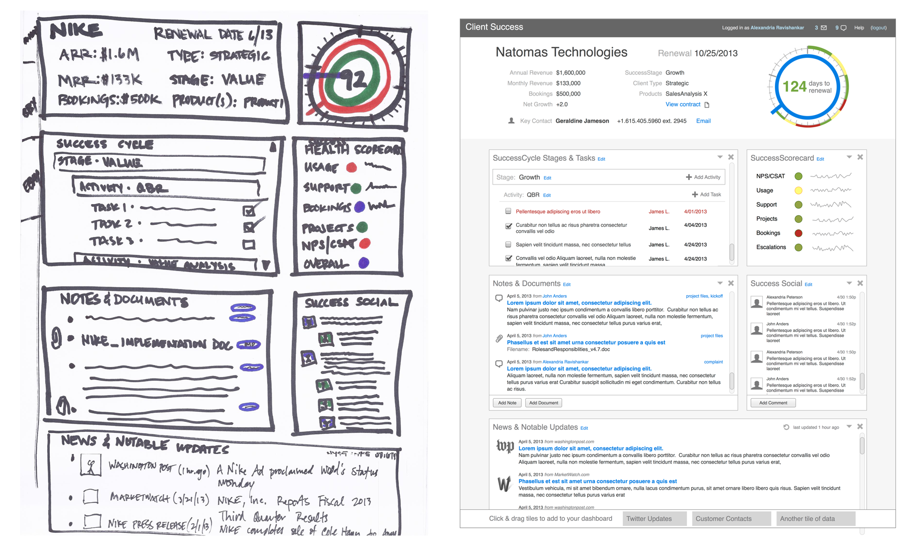
Digital wireframes made the design a little more “real”, and I was better able to explore with Dave the major pain points of his potential customers and determine whether the design appropriately addressed them. I was concerned a bit with the sheer density of information he wanted to present and wondered as well how this interface would fit into the rest of his envisioned customer satisfaction platform. Dave was completely open to the feedback, and I advised that rather than just take my word for it, he present it to some of the people he’d already interviewed.
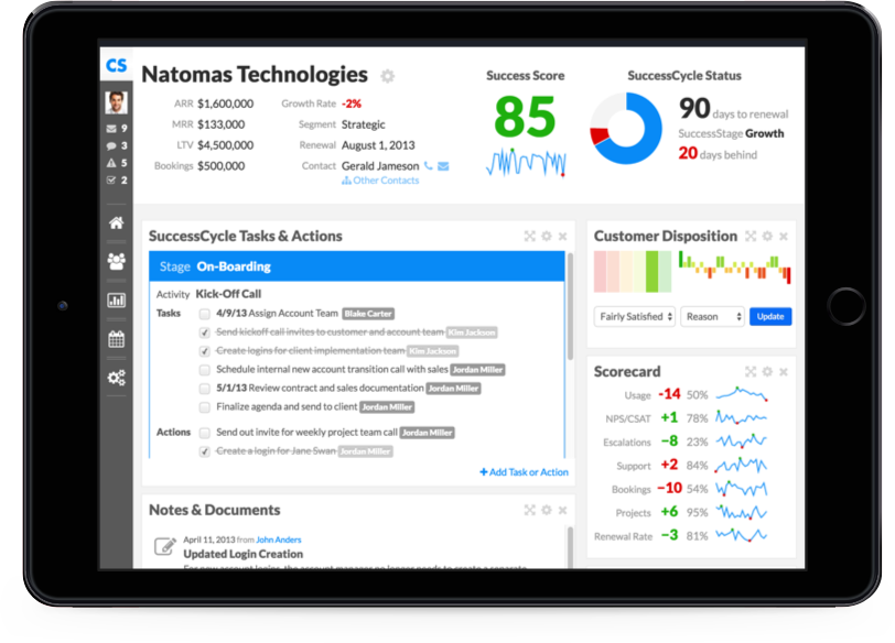
Their comments confirmed that the interface had some rough areas, particularly with the idea of the SuccessCycle design element. The initial concept was to combine into one widget how many days until a customer contract was up for renewal, where the client was within the stages of an engagement (onboarding, deployment, use, etc.), whether they were behind schedule, AND how satisfied the customer had been within each stage. This proved to be too much for one visualization, so I gave these separate elements their own designs, and suggested the idea of some kind of high-level success score that would give the idea of how the contract was going, the SuccessScore.
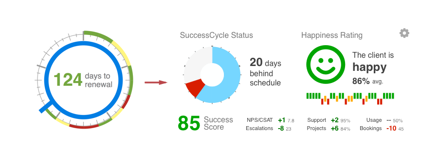
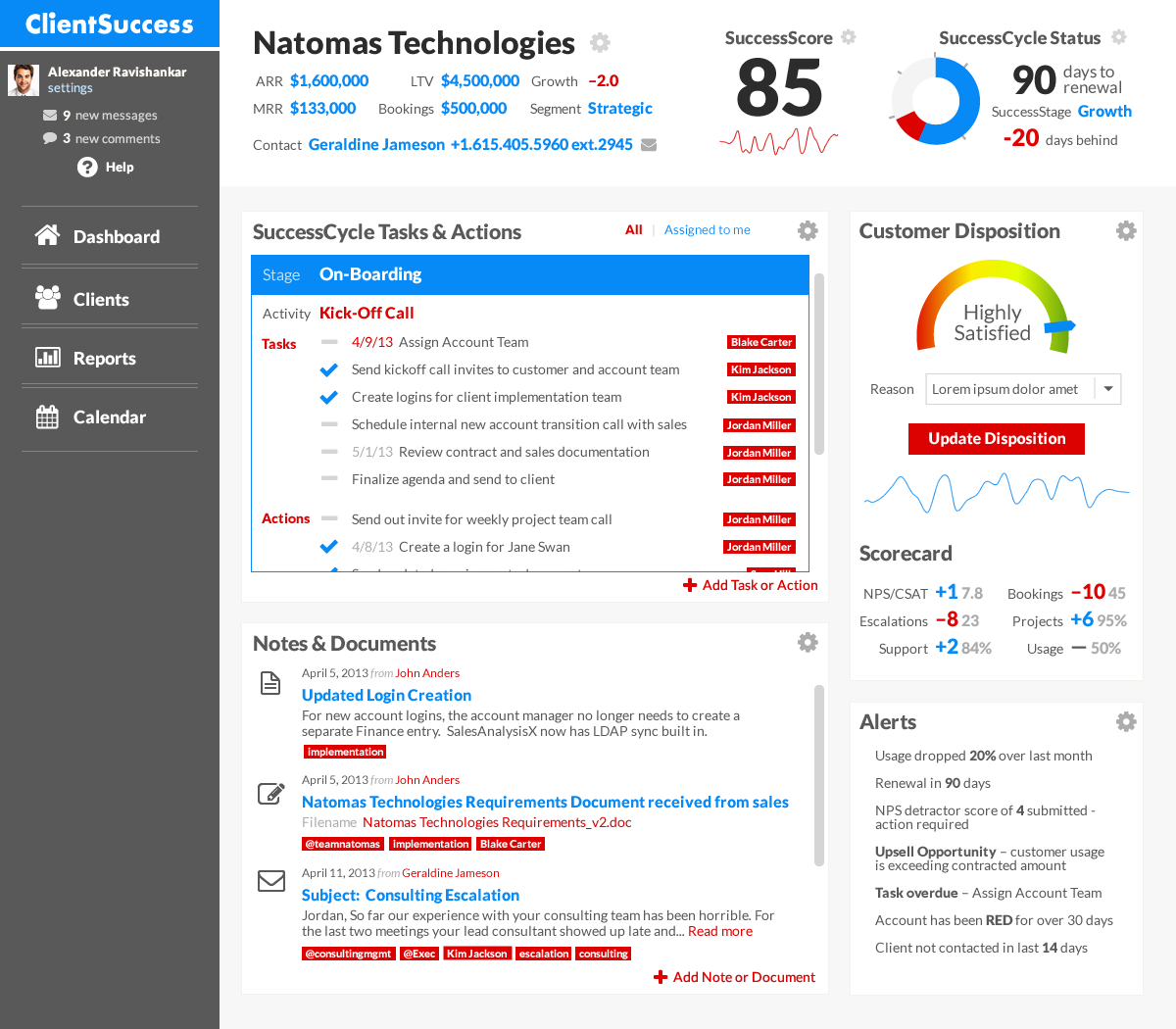
Dave liked the changes (apart from the smiley face) and was ready to review higher-fidelity design comps, with fonts and colors and so forth. I proposed a couple different treatments to consider, neither of which Dave particularly liked. At first I thought it was because he had gotten used to how the new designs tweaked where page elements were on the page (a good reminder that client expectations are being set constantly, whether we explicitly mean to or not). As it turned out however, Dave had started a branding process with a graphic designer and had selected a company logo, typeface, and color scheme to use (based on the cover of management guru Jim Collins’s book), so I used those design elements instead, iterating until Dave felt comfortable with all the elements. Well, almost all—the happiness rating had changed into a Customer Disposition widget, yet it still took up too much visual space for what was only one of many key performance indicators to track.
It was at this stage that I needed more user input, and Dave wanted to give a more realistic experience for those users. I suggested a clickable prototype with static screenshots, using a tool like Invision (one of my favorite tools for creating interactive prototypes for user testing). However, Dave wasn’t just interested in feedback anymore, he was seeking potential first customers, and wanted to be able to show them something more realistic.
Oh, and he had already scheduled a few client meetings the next week, so could I go ahead and create a responsive, tablet-friendly version with updating elements and drag-and-drop functionality that he could demo by then? It was serious crunch time, so I ranked with Dave which of the various elements he wanted to demonstrate and which we could hold off on, creating a guided experience through the app so that elements that didn’t work (yet) could be artfully avoided even as things like entering text, responding to different screen sizes by collapsing the sidebar, or moving widgets worked like a charm.
As it turned out, there were a few benefits of the tight timeline. The first was the clarity that it gave to prioritize which elements and information were truly the most important, which led Dave to push some things off the default dashboard, simplifying the cognitive load. Another related to that pesky Customer Disposition dial. My Javascript skills just weren’t up to snuff to map mouse and touch movement in a radial path in the amount of time remaining, so I replaced it with a more simplified stepper, with defined satisfaction ratings to choose from. This was very well received by the users and because it took up less space, it made the interface even that much cleaner to look at and work with.
If you want to check it out, in all its glory, email me and I’ll send you a login).
03. The Result
With a high-fidelity, interactive, web-based prototype, Dave was able to present his ideas in a way that clicked with prospective customers and investors. Within a year, ClientSuccess had raised $1 million in seed funding and had begun building out a full team and business to support Dave’s original vision. While I was not involved in the subsequent development of the tool, it’s fun to peek at how the live platform has retained some of those key design elements I proposed in the initial concepts, even a few years later.