Ayn Rand Campus
Online eLearning & Student Portal
The non-profit Ayn Rand Institute wanted to teach Objectivism through online classes. More than just video-based elearning, these courses would be part of an entire platform where people could connect, compare notes, even take courses simultaneously—the Ayn Rand Campus.
Before we continue, let me get one thing out of the way: this project failed. While the client liked the work we delivered, it was never implemented because—frankly—we did a lousy job matching functionality with budget. Money ran out before anything could be built at the scope we were proposing. Read for more of what went wrong and what could have been done differently.
01. Wireframing the elearning course
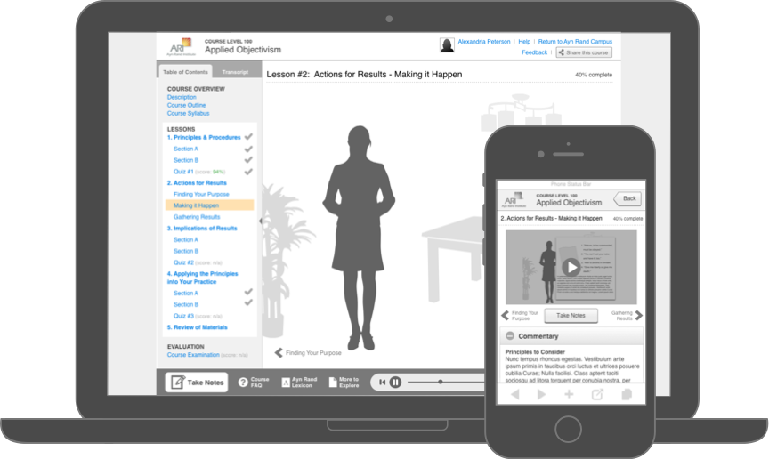
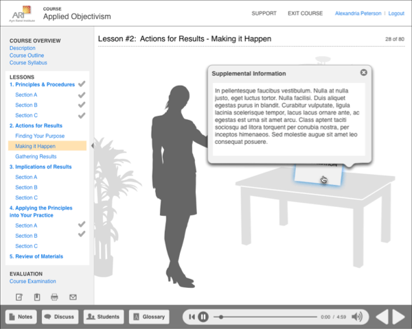
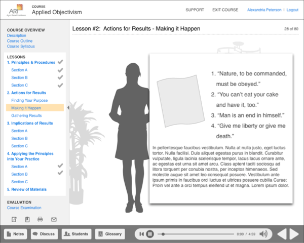
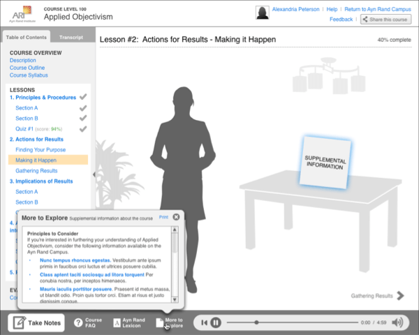
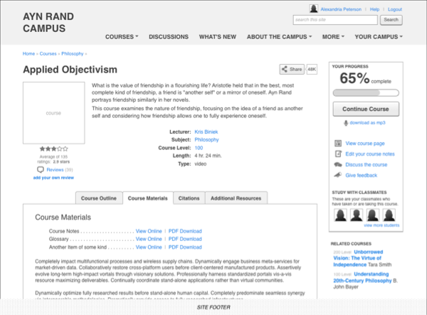
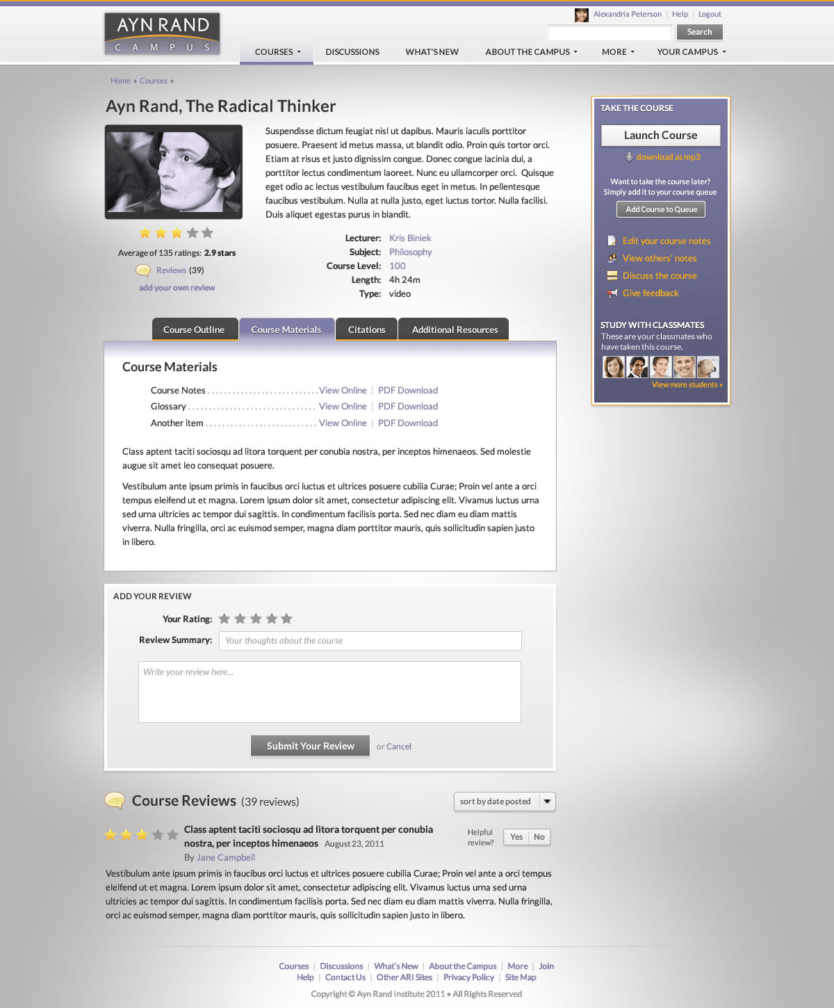
Initial requirements called for a video and audio elearning course that would use a Flash-based interface for students accessing the site on their desktop, and I was brought in to design the elearning interface for the courses themselves. The scope soon expanded to include features for taking notes, discussing the course and connecting with other students while taking the course itself, and looking up words in a glossary. The course content also changed, from video-only to a combination of recorded video, audio and text, along with quizzes and supplemental materials. I iterated through wireframes to accommodate these changes, while cautioning the client about how added complexity might affect project success. Yet when they told us an influential donor was funding this work and wanted to see something special, I continued (bad, I know).
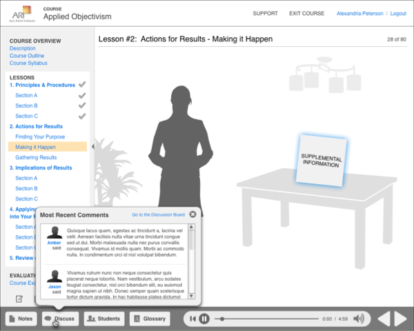
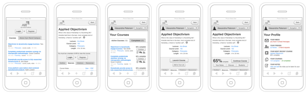
Around this time, the Institute decided that they also wanted the courses available via mobile devices and tablets. Rather than develop a dedicated app and risk not having as much adoption, they wanted to pursue a web-based solution. This meant that the Flash functionality of the desktop version would need to be replaced by HTML5 video on mobile phones and tablets. Knowing we had to find ways to reduce build complexity, I leveraged design elements from jQuery mobile and created a new version of the course interface that would accommodate both smartphone and tablet users via a responsive layout, while operating within the constraints of the smaller screen sizes, slower network connections, and technical shortcomings of these devices. For instance, at the time, Mobile Safari (the web browser on Apple iOS devices) spawned videos in a separate app window, making it impossible to watch a video and interact with the screen at the same time on an iPhone. Thus discussion and social functions were dropped from the mobile version, which led to the same features being dropped from the desktop version too.
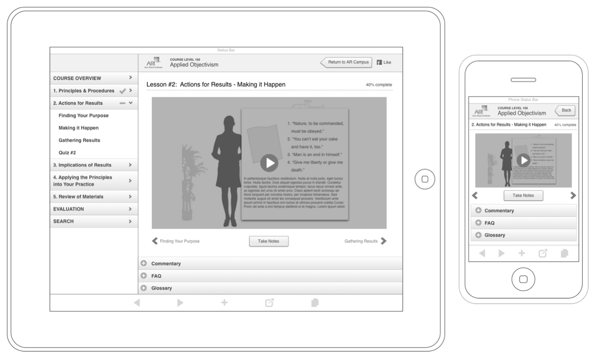
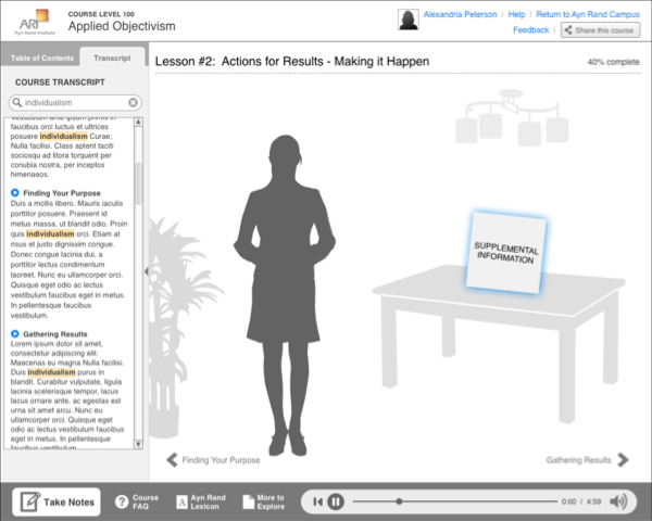
However, the Institute was really set on having the more immersive experience we had proposed in the Flash-based version of the site (and we wanted to show off our dev skills), so we agreed on a hybrid solution, in which the mobile and tablet courses would run a reduced-functionality HTML version, and the desktop courses would be delivered via full-fledged Flash interfaces, with rich-text note taking, glossary look-up, searchable transcriptions, and interactive videos. (Two similar but different experiences for the price of two, what could go wrong? ?).
02. Designing the Campus
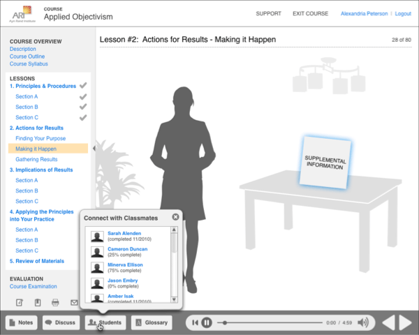
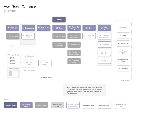
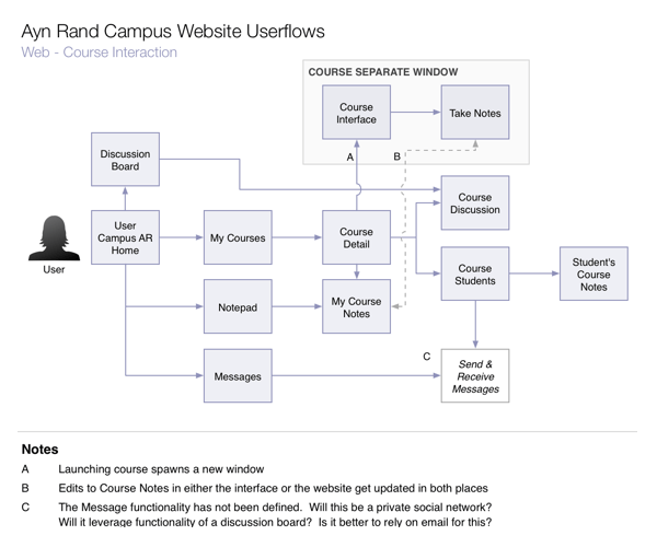
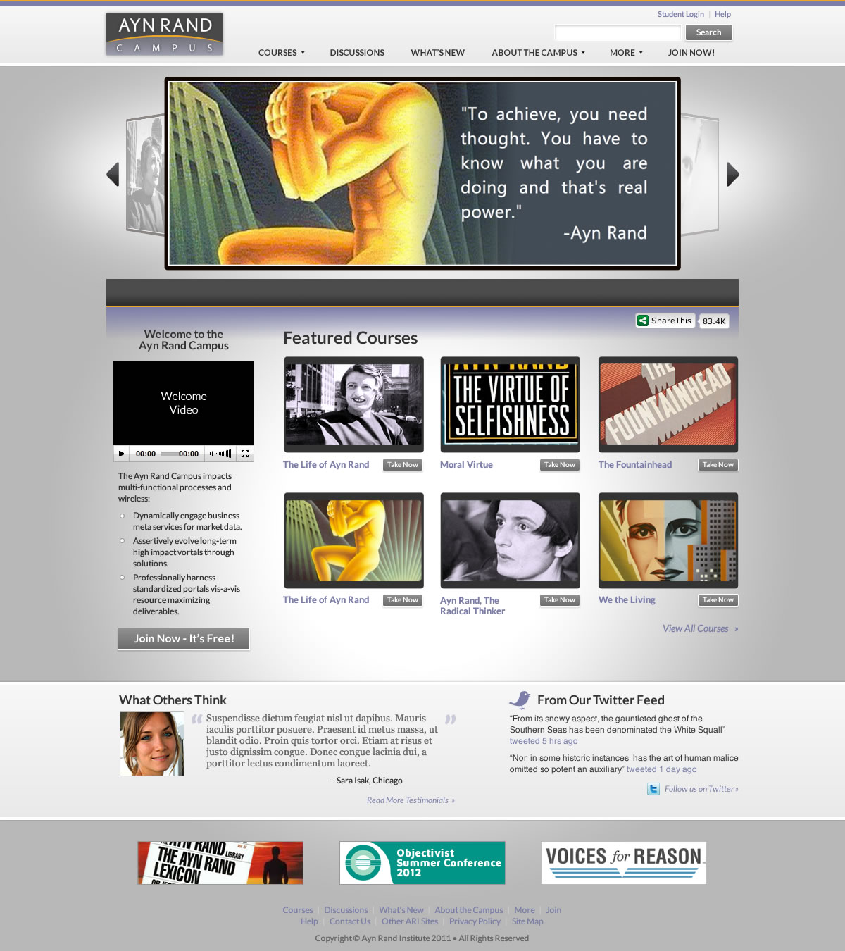
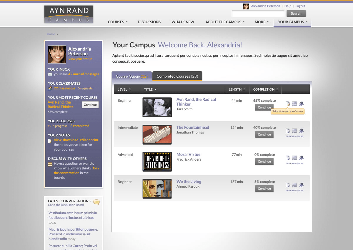
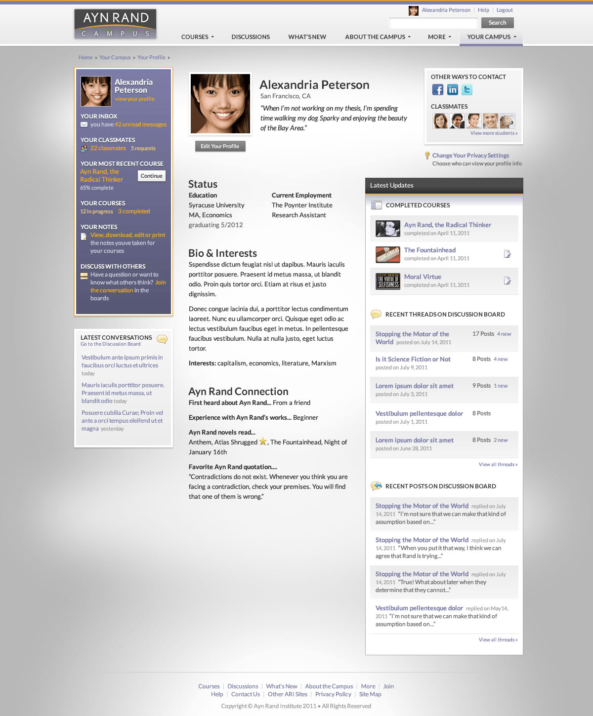
As the elearning course interface was finalized, we began discussing the main campus website. Through onsite discussions about client goals and user needs, a series of requirements and priorities shaped wireframe designs. Social features for inviting friends and seeing who else is taking a course were added to increase interest for casual learners. Online discussion boards were incorporated, as was campus mail, to further the student connection to one another. This also would allow ARI to know which topics were of most interest so they could be made into new courses in the future. Yet it also made for many, many screens.
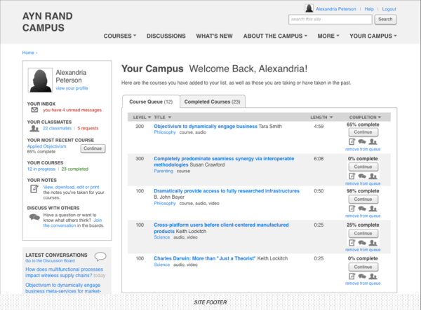
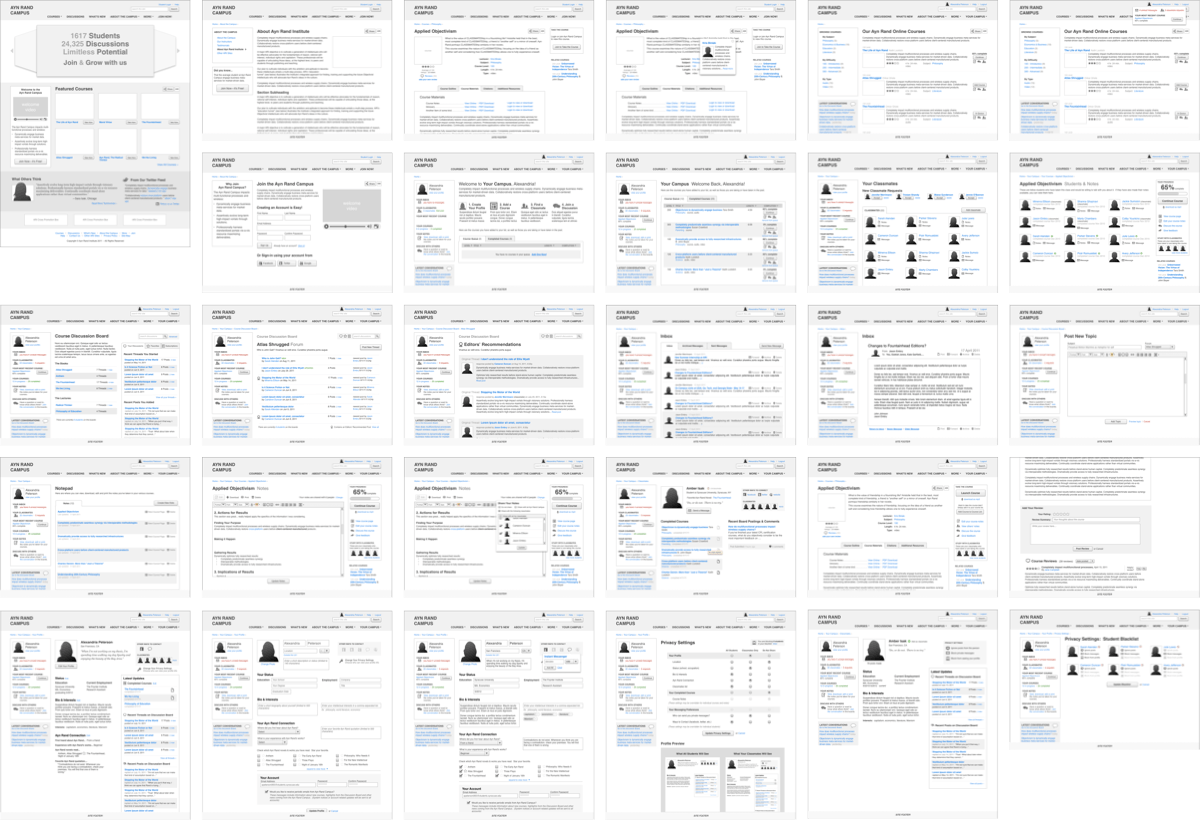
To keep track of all this interaction, I also designed an information architecture for the Ayn Rand Campus and created user flow diagrams to show how users would navigate the site and courses. These helped ARI identify gaps in their service offerings and refine approaches to working on the site.
While I worked on the wireframes, visual designer Chad Divine created design comps for both the elearning course and the main website. The client team liked the designs but wanted to see how they would apply to more screens, so I standardized the design elements and applied it to all the other pages of the campus student portal and courses.
03. From almost complete to completely scrapped
Alas, further work on the project was suspended. While the client liked the designs we had created, cost overruns associated with filming the course videos themselves had impacted the overall budget for the project. And with the expanded functionality of the campus, the costs for developing that were too much for the Ayn Rand Institute. They decided it would be better to hold off on building any of it until they could deliver all of it.
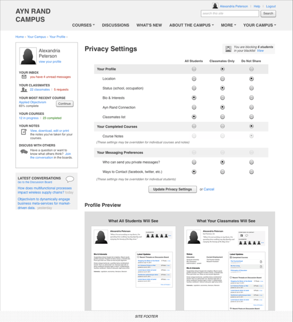
Looking back, I wished I had pushed harder for launching earlier with a more minimal feature set rather than just going along with whatever was requested. We were basically recreating Facebook, all in one project. For example, I spent a few cycles designing how much personal information should be made available to other students—I had designed an entire privacy suite.
Where pretty much any functionality can be mocked up in a few hours, wireframes and design comps are invaluable in testing and iterating ideas rapidly, yet they don’t show just how complex the underlying solution may be. And although the development team vetted the ideas we were proposing, there needed to be clearer communication at the account and project management level for how they would impact timelines and budgets.
Although I may not agree with Objectivism as a philosophy, I still wanted their project to succeed, so I was happy to see that a few years later, ARI tried again, and launched what looks to be a successful elearning platform for their materials. Gone are the discussion boards, the self-administered study groups, the private social network, the detailed review system. Even the courses themselves now appear to be simple recorded lectures or audio presentations, with nary a green screen in sight. A testament, no doubt, to starting small, delivering what you make, and working from there.