Calumet Lens Showcase
Web-Based Lens Simulator
Ever tried to buy a camera lens? It’s tricky when different kinds of lenses affect photos so differently. To make this easier, Calumet Photographic asked Simply Interactive to create an immersive web experience that would teach the basic principles of photography & drive users to their ecommerce store.
01. Situation
Choosing the best lens isn’t about just buying the most expensive one. It’s about knowing the types of photos you want to take and understanding the trade-offs that come with that. For instance, lenses with a lower f-stop are great for taking photos of fast-moving objects (like a child playing sports), but not so great to have many items in focus at once. And while a telephoto lens is fantastic for taking a picture of an animal from far away, it can’t take in a whole vista at once.
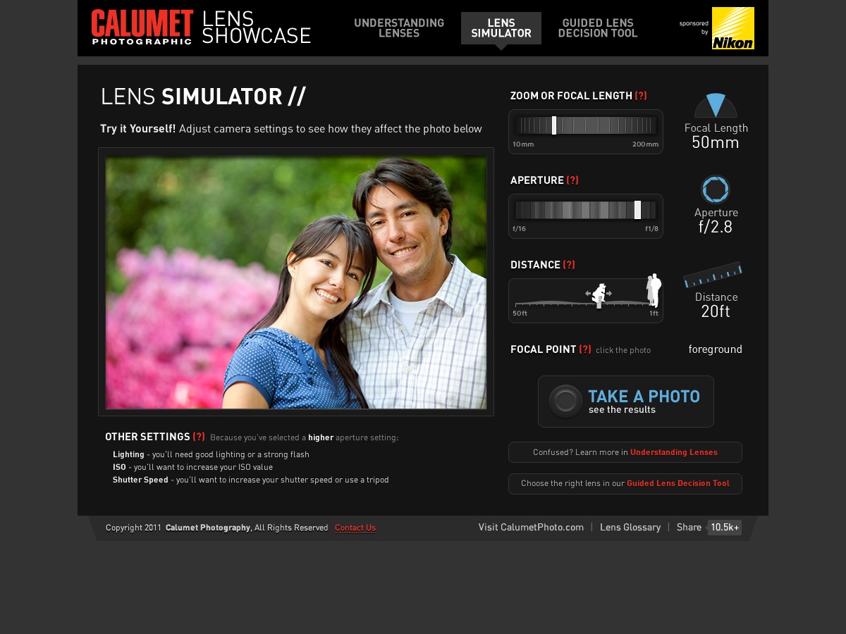
In order to show these trade-offs as realistically as possible, Calumet wanted an interface that would demonstrate various camera settings and how they would affect a photograph. The user could then see and purchase which lenses capture the particular affect they wanted to achieve.
02. Action
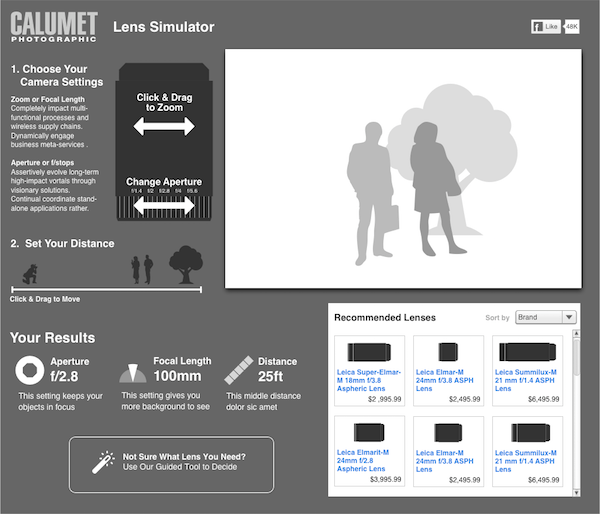
My idea was to use an image of an actual lens and have the user click and drag the zoom ring and change the aperture just as they would with a real camera. Yet to convince the client of this in a wireframe, simple boxes and arrows couldn’t cut it. Instead, I created what I like to call a “wire comp”—a higher fidelity version of a wireframe that present not just layout and content, but also interaction elements that convey the feeling of the final design.
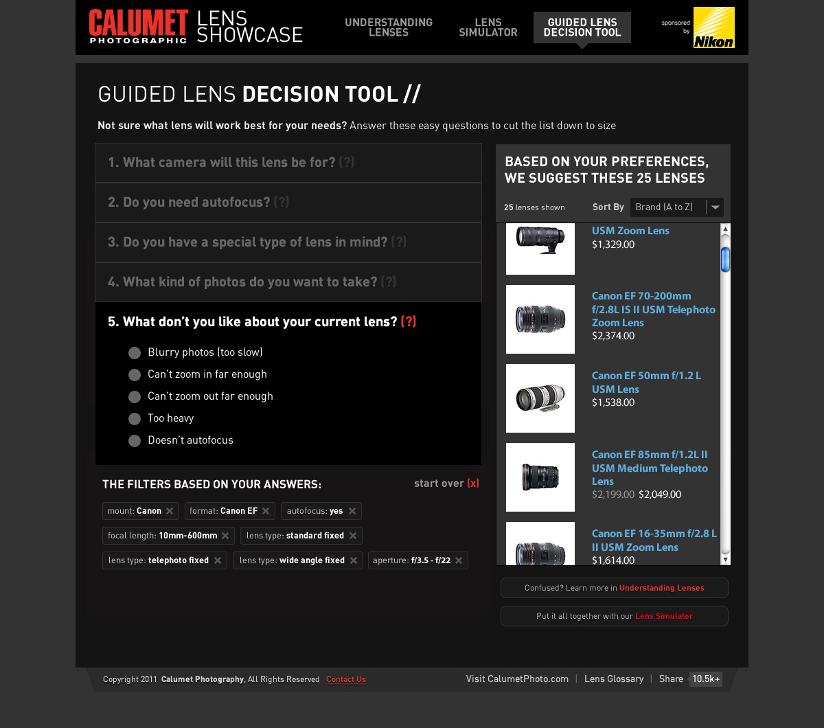
The first version I designed was fairly simple: the user would select a distance from a subject and adjust the zoom and aperture, and a corresponding image would update accordingly. At the same time, a list of available lenses for sale would filter to only show those that could take the given photo with the settings the user selected.
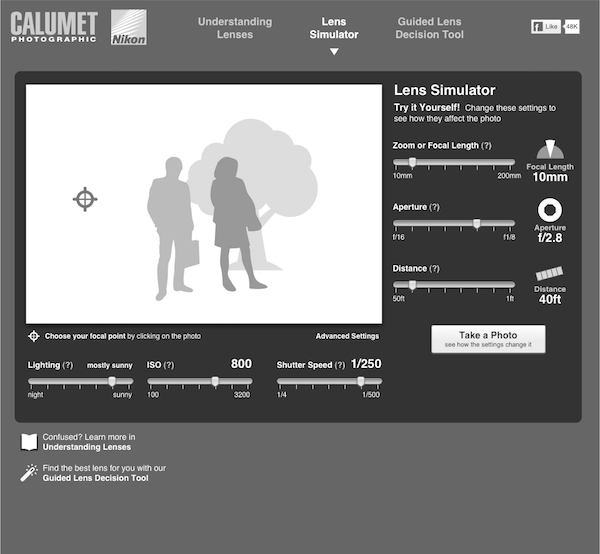
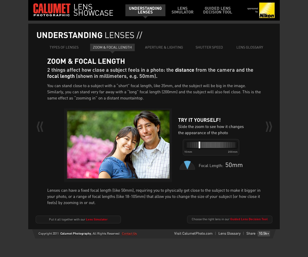
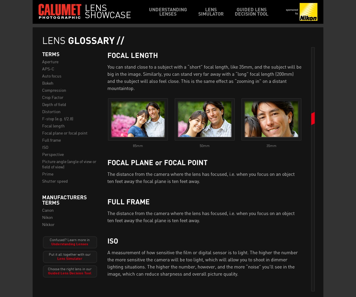
Calumet liked it, but wanted the ability to add more settings and features, including lighting, ISO and shutter speed. To do so, I had to drop the camera lens metaphor altogether to fit all the options in one screen area. At the same time, I noticed that moving between the different sections of the site weren’t very clear, so I added navigation to make it more obvious how to get to the lens tutorial or to the guided lens purchasing tool.
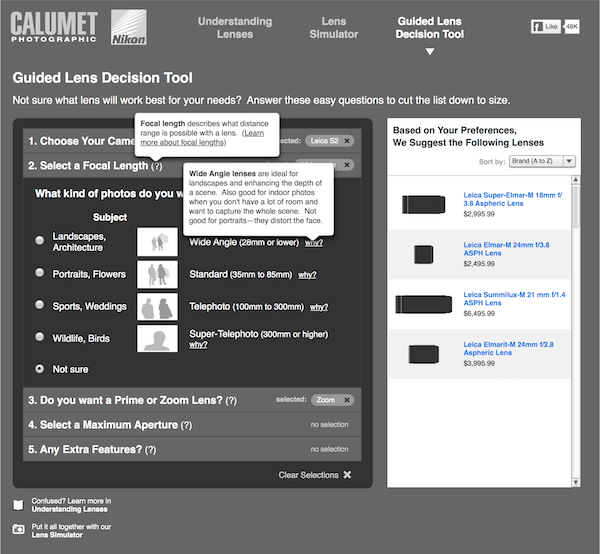
While the client appreciated the new navigation and having all the options in the page, they didn’t like dropping the camera lens metaphor entirely. They realized as well that although the additional settings were technically more accurate for getting a true picture of a photo, they were probably going to be a bit much for an amateur photographer to play around with. At the same time, because the number of potential lenses to show could be in the dozens, it made more sense to move those lists into the decision tool, where the user could answer additional questions, like camera brand and model, for more relevant results. A few more rounds later, and the wireframes were approved.
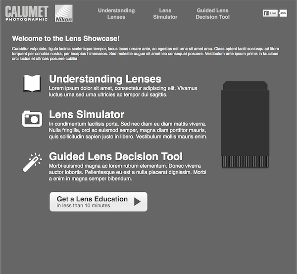
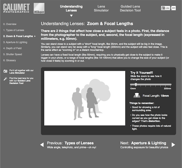
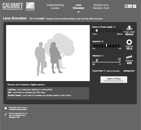
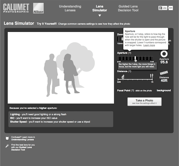
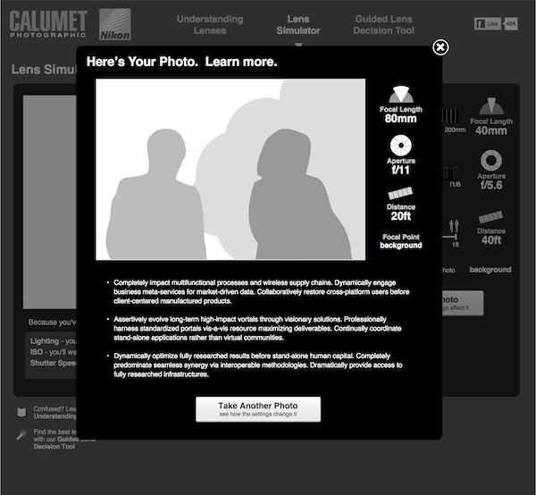
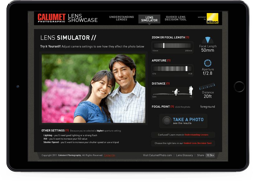
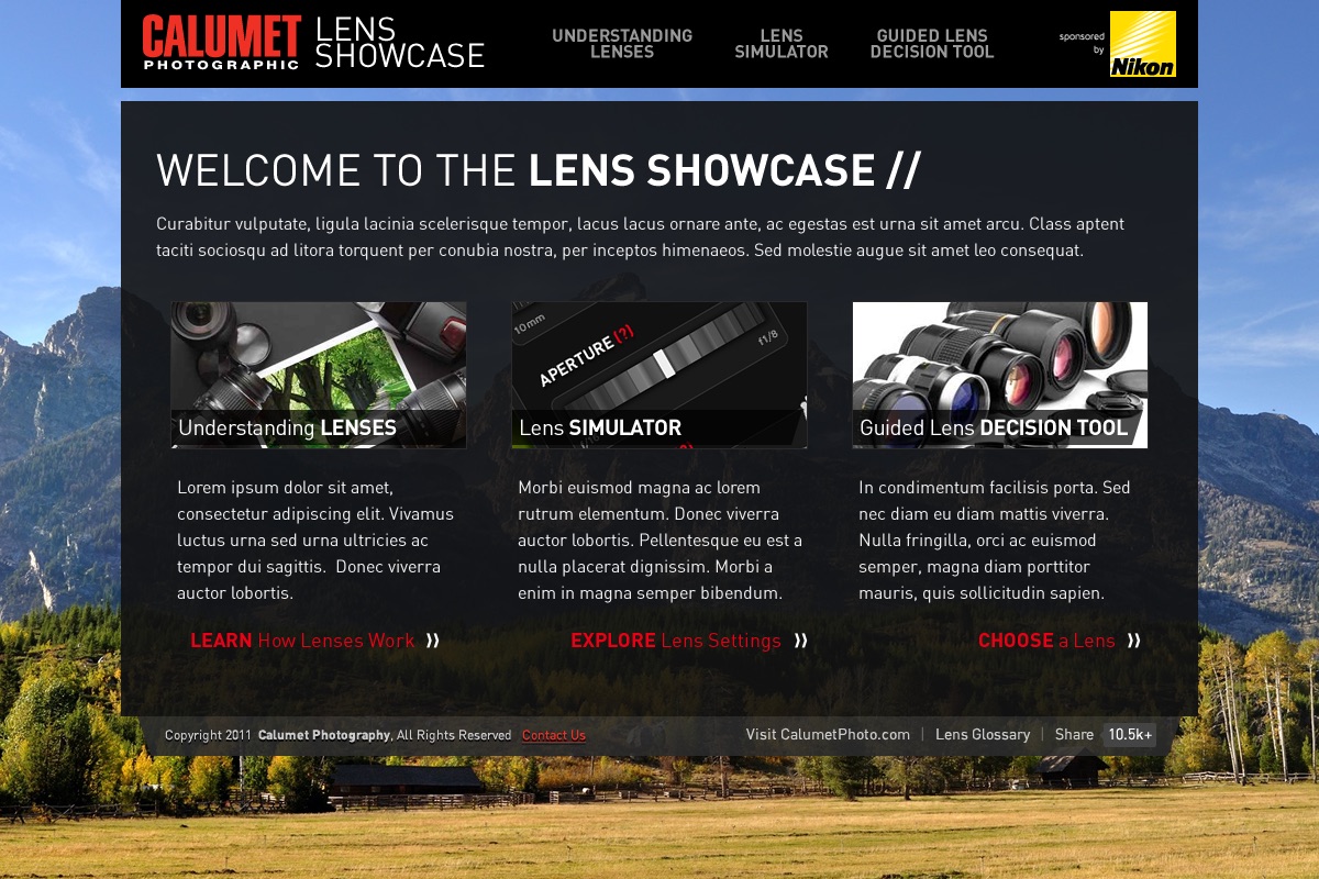
I then began to create design comps, and because of how high-fidelity the wire comp for the Lens Simulator was already so detailed, I decided to present designs for the home page so that there was the most opportunity for new thinking. Calumet wasn’t sure about branding, so I provided a few different ideas that they could react against. The first ones were lighter in color and friendlier in font and imagery, intending to be inviting and non-threatening for the casual photographer. The later ones were two takes on a darker, more angular and technology-oriented look-and-feel, intending to convey seriousness and expertise.
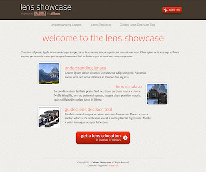
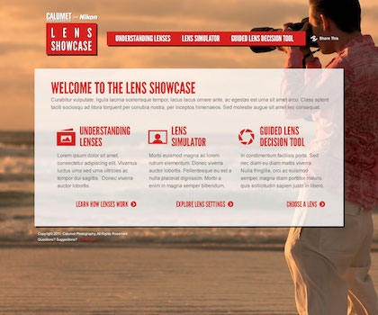
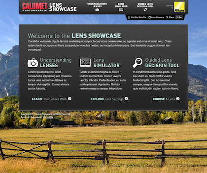
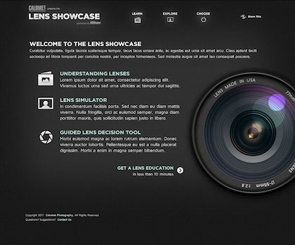
The client team came back liking them all, which is flattering but also frustrating when trying to gather consensus on one direction to pursue. It was luck, I suppose, when their marketing team came back with fonts and colors that should be used (yes, that would have been nicer to have before the design comps were begun, but sometimes you just have to roll with it). After a few more rounds, the design comps were completed.
03. Results
Rob Williams (the developer) began implementing the design into code, and because of the relative newness of some of the techniques he was using, such as the HTML5 range control to simulate the zoom, aperture and distance selectors, I helped a bit with making sure the CSS would work correctly in different browsers and had appropriate fallbacks in place.
Everything was working pretty well, when the client threw a small wrench into the process: they wanted the entire site to be 100% Flash-free, so it could work on smart phones that didn’t support the Flash format. While the original plan all along was to have all the controls be standard HTML—well, HTML5—the actual modifications to the photos themselves were going to use Flash because it could non-destructively change exposure, add selective blurring to simulate focus control, and so forth.
With this request, Rob had to go back and make major behind-the-scene changes using SVG filters and VML to attempt to apply all the functionality we wanted. Amazingly, Rob got it all to work or offer clean alternatives for all modern browsers both desktop and mobile, and the client was very pleased.
I really wish I could point to a working demo of the system in place, but sadly Ritz Camera bought Calumet Photographic and their website is no more.☹
